

Transforming an AI-Powered MarTech Platform: Aampe Case Study
Overview
For a year and a half, I worked as the Product Designer for Aampe, an AI-powered marketing technology startup that helps companies generate and distribute personalized marketing messages. For an entire year of this period, I was the sole designer responsible for the platform's evolution. I significantly improved the platform's usability and user experience while helping the company expand its functionality and secure $18 million in Series A funding in December 2024.
The Challenge
When I joined Aampe through Eleken, a SaaS design agency, in September 2023, the platform faced critical challenges that made it difficult for users to harness its full potential:
- Complex data was difficult to interpret, as tables lacked clear labeling, hierarchy, visual distinctions, responsive design, and proper alignment for readability
- The color palette wasn't accessible, causing readability issues
- Poor navigation led to user misguidance
- The product had grown organically, resulting in inconsistent design patterns
- The company needed to grow quickly and required design support for rapid feature creation
What made Aampe unique — and especially challenging to design for — was its marketing approach. Unlike traditional platforms where marketers create individual messages, Aampe users develop hundreds or thousands of message variations, with the platform's proprietary AI agents (not a GenAI integration) selecting the optimal version for each recipient based on their preferences and behaviors. This authentic AI technology forms the core of the product, requiring specialized design considerations for its unique capabilities.
My Approach: Looking Through the Lens of Variation
Establishing Visual Foundations
My first priority was addressing the immediate visual issues that affected both usability and visual perception. Within my first four months, I:
- Created an accessible color system that worked for users with color vision deficiencies
- Improved typography and its alignment with icons throughout the interface
- Standardized spacing and component styles for consistency
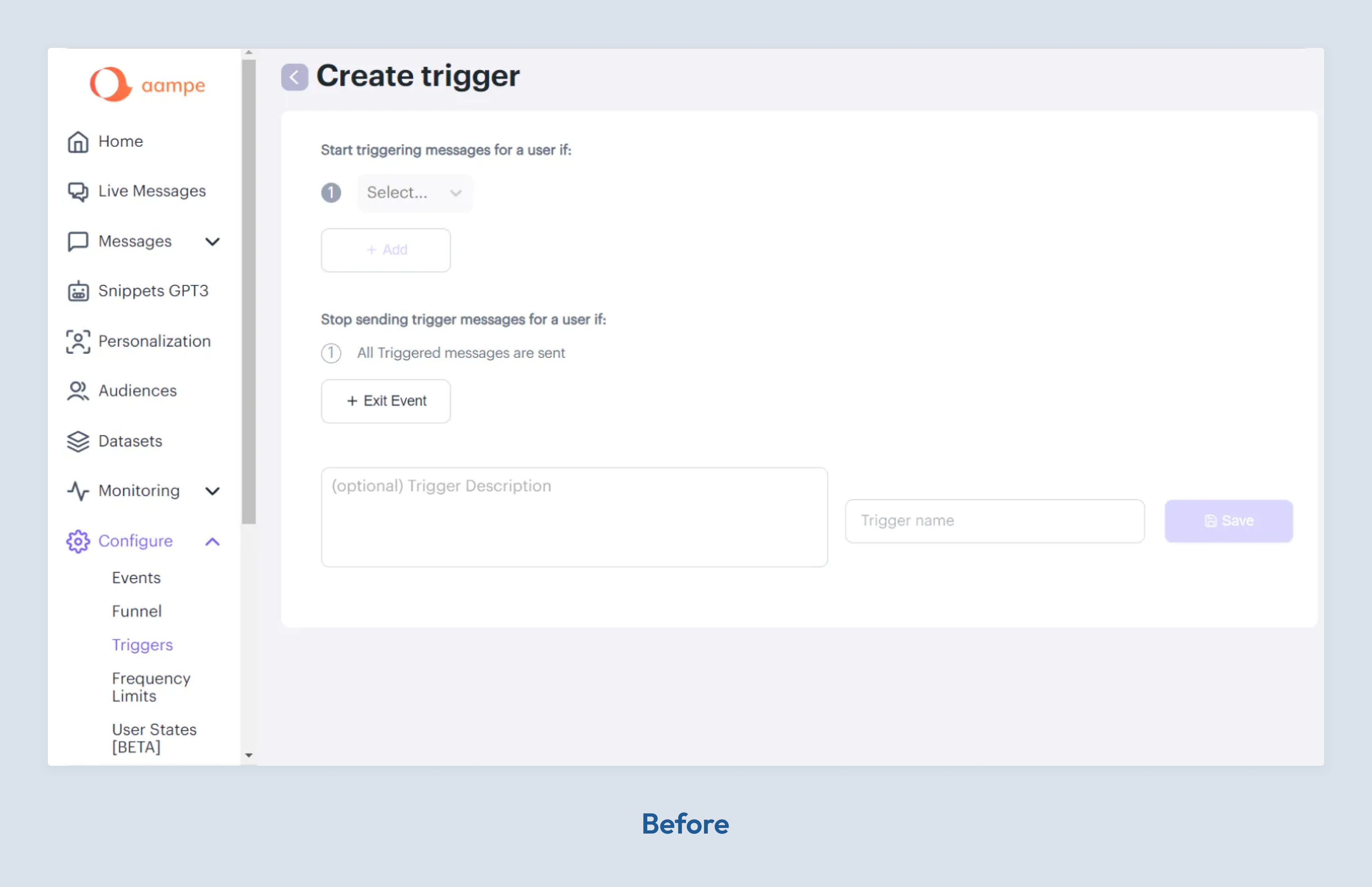
- Restructured navigation to be more intuitive, renaming confusing sections and implementing a collapsible sidebar
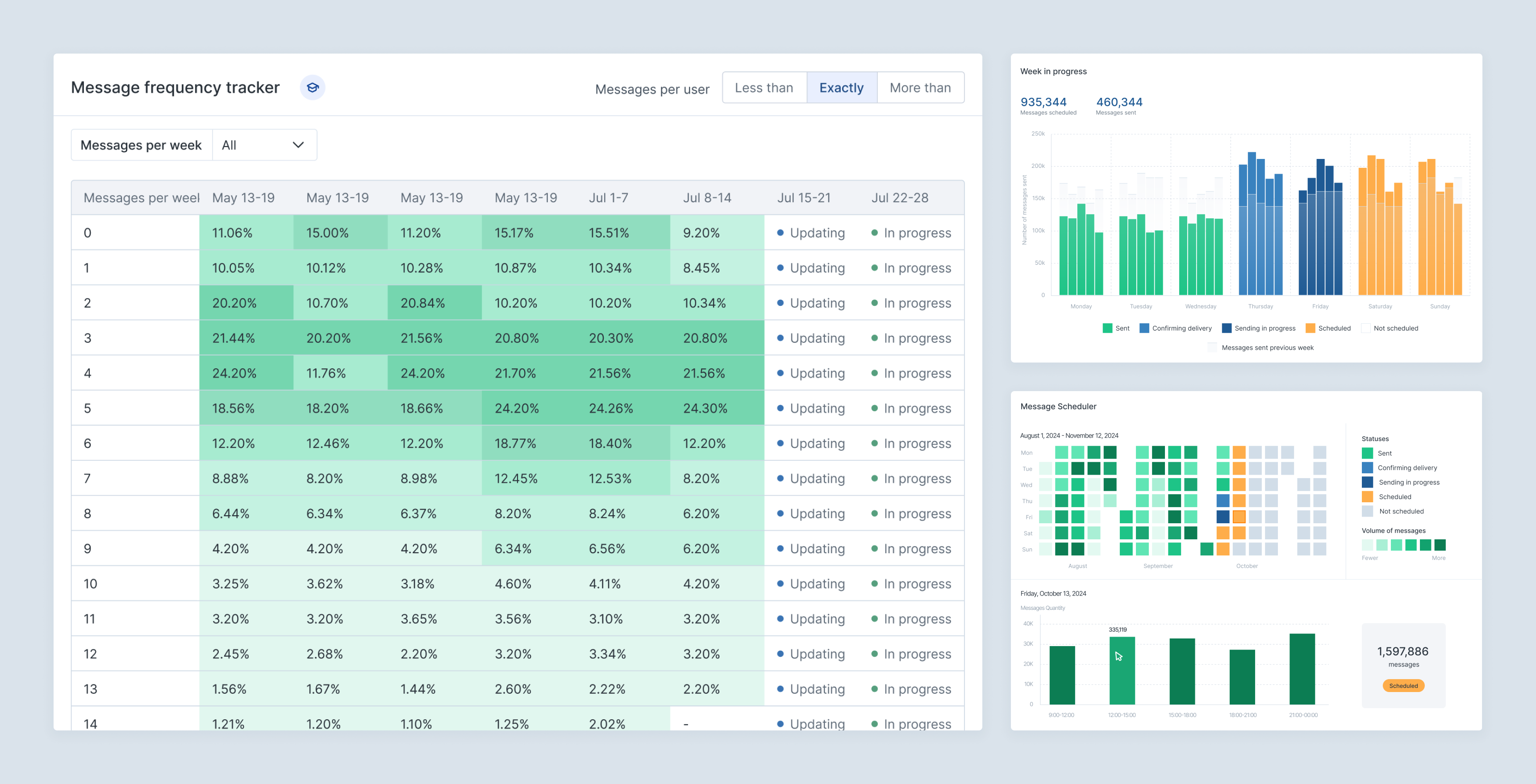
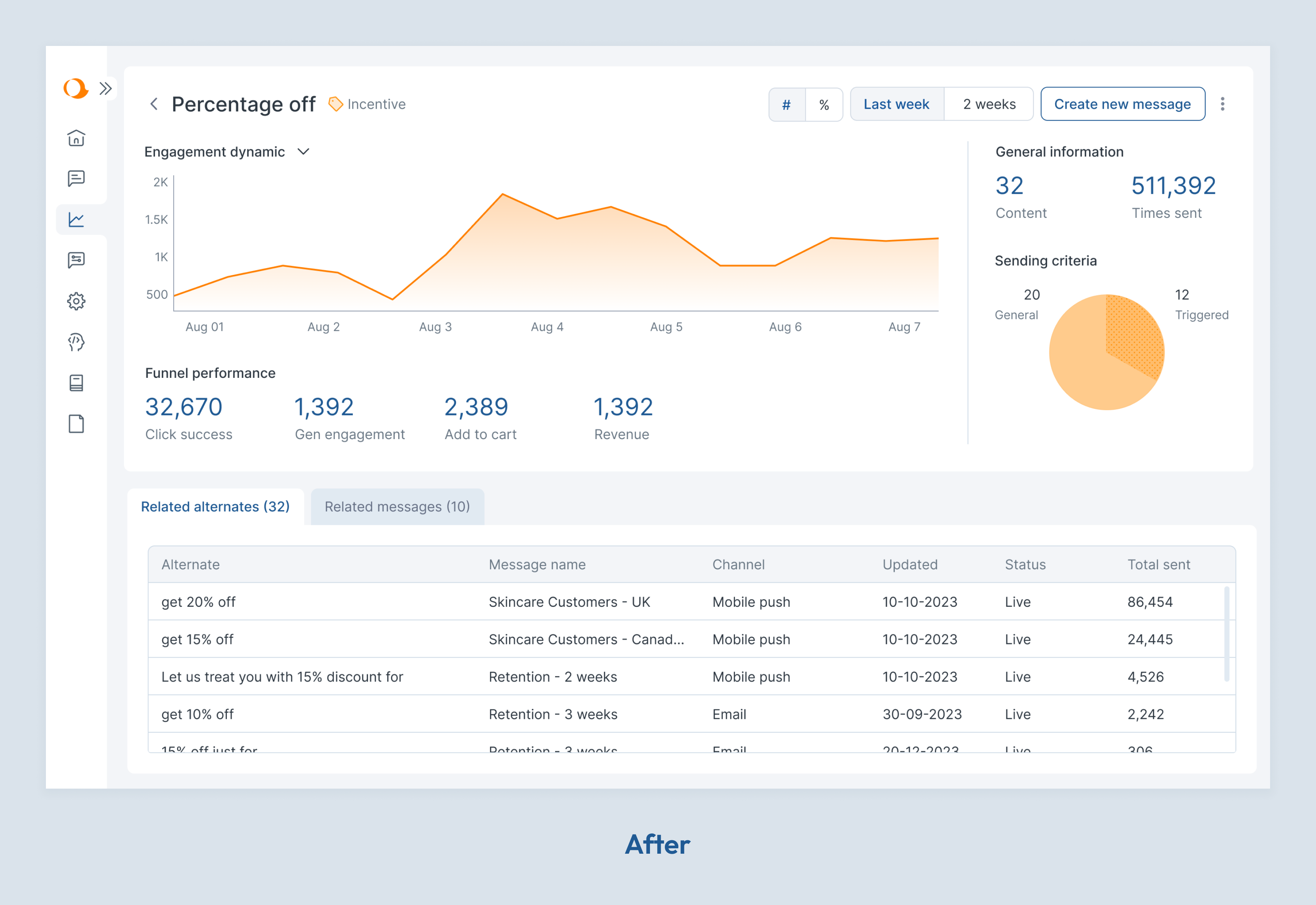
Transforming Data Visualization
As a data-rich platform, Aampe's tables were central to the user experience but struggled to communicate insights effectively. The tables were slow, had outdated styling, and exhibited non-optimal column behavior. I researched solutions, suggested implementing AG Grid, created new styling guidelines for tables, and guided the implementation of these changes.
Beyond technical improvements, I transformed how data was presented to make AI decisions more transparent. I combined tables with data visualizations in strategic places where it could help customers read data faster and identify trends immediately.
For the Frequency Tracker, I replaced a basic table with a heatmap visualization showing message distribution patterns across different user segments. This made it immediately clear which users were receiving too many or too few messages—critical for preventing both spam and missed opportunities.
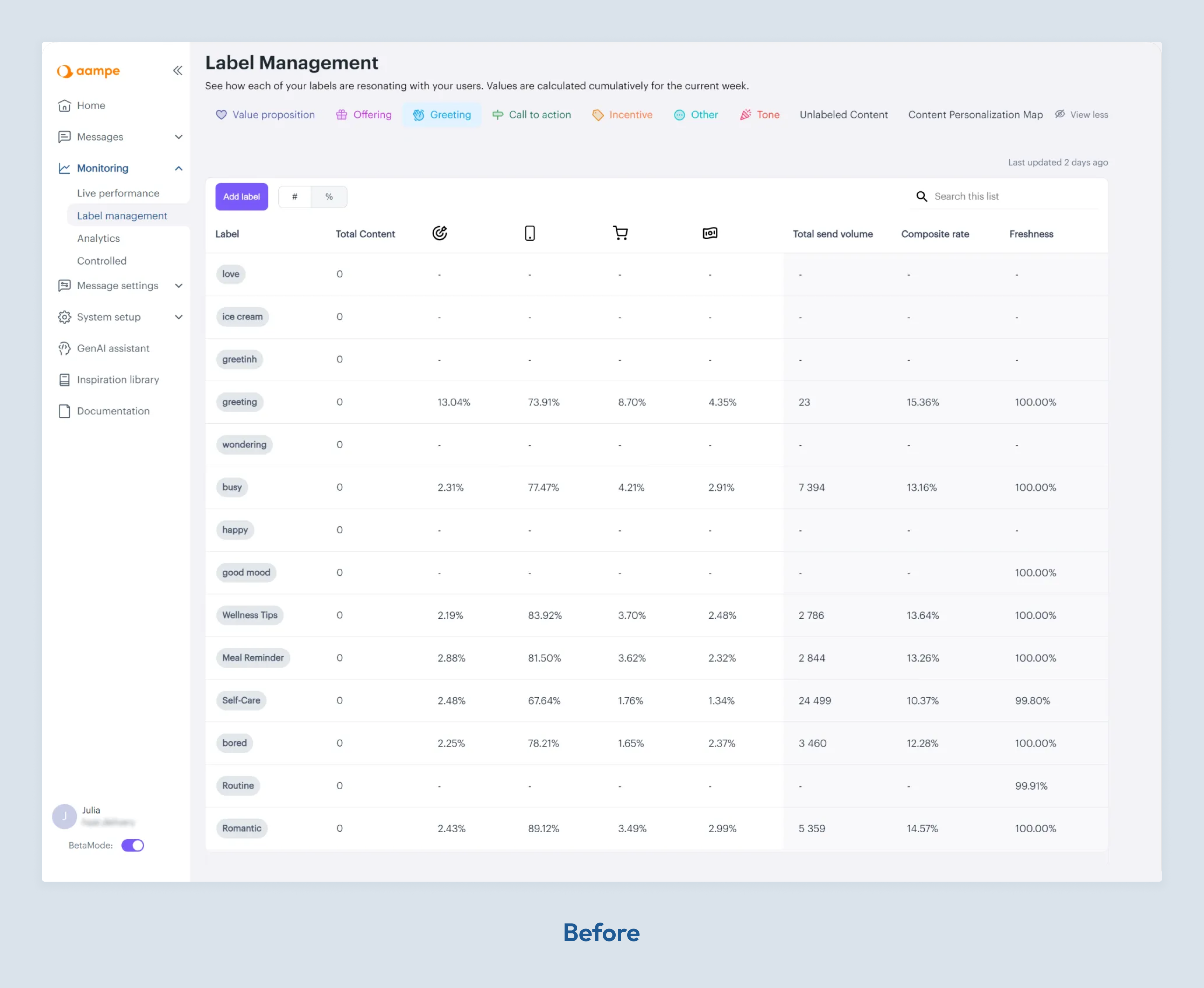
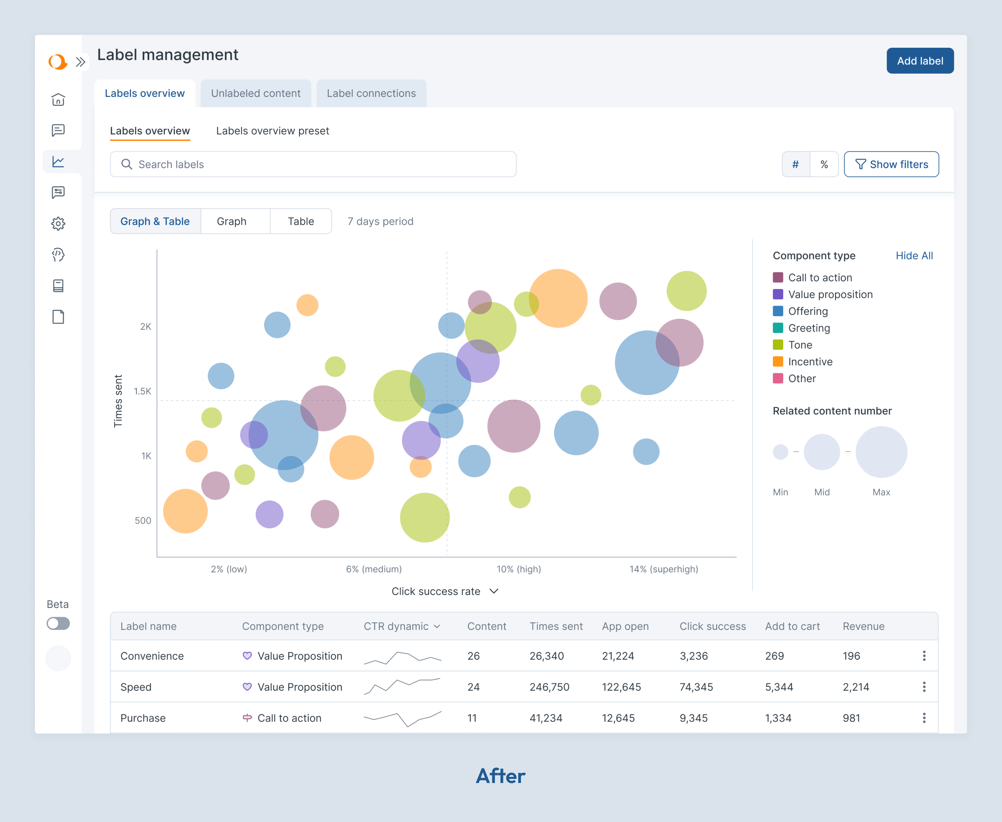
The Label Performance feature presented a unique challenge. Labels are tags applied to message components that help AI learn user preferences, but the original table format made patterns difficult to spot. After consulting with data scientists and customer success, I designed a bubble chart visualization where:
- Colors represent different label types
- Size indicates content volume
- Position reflects both usage frequency and success rates
- A customer success representative from Aampe and I presented this design to a major client, who immediately noted they could see patterns they'd never noticed before
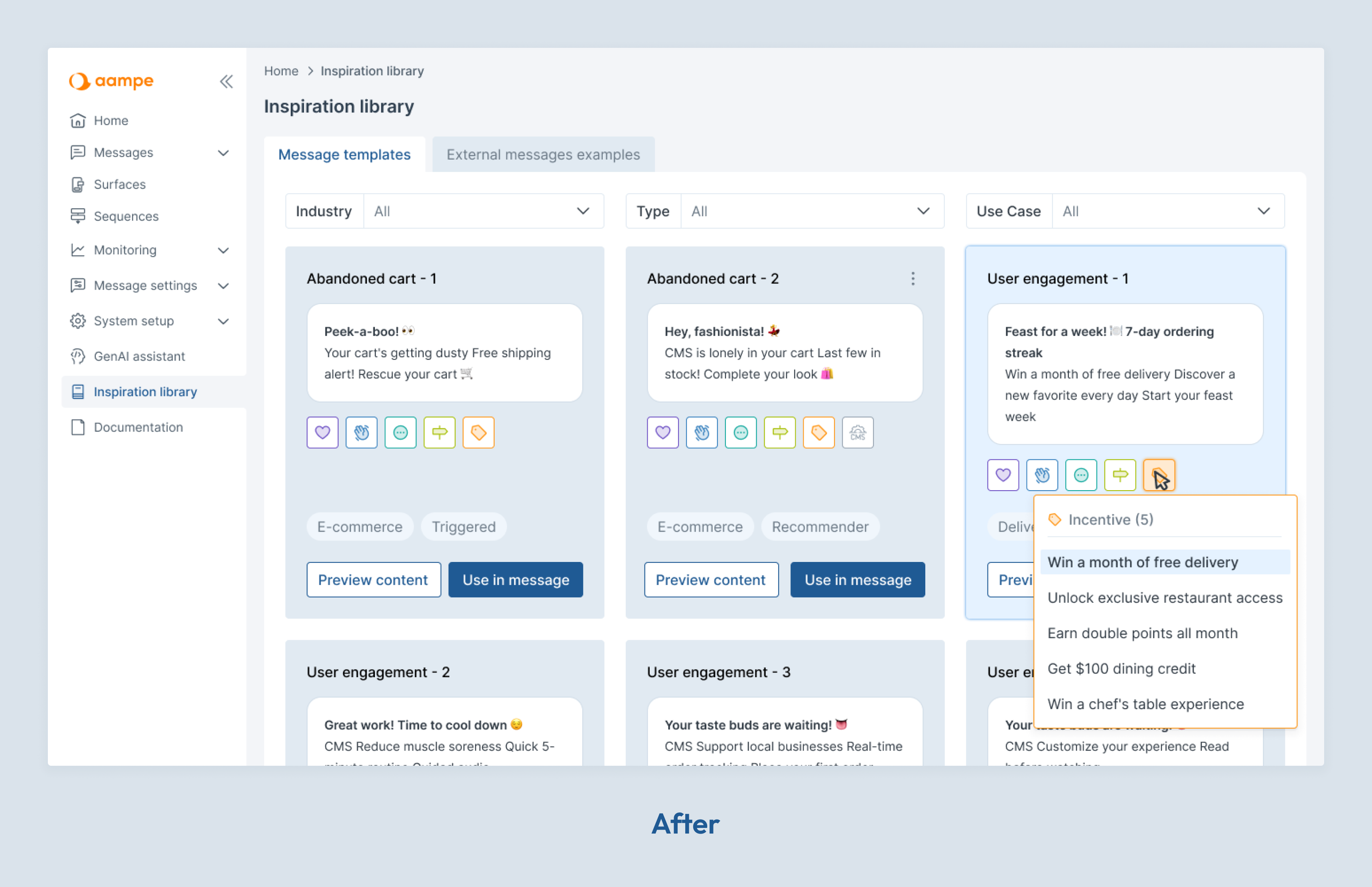
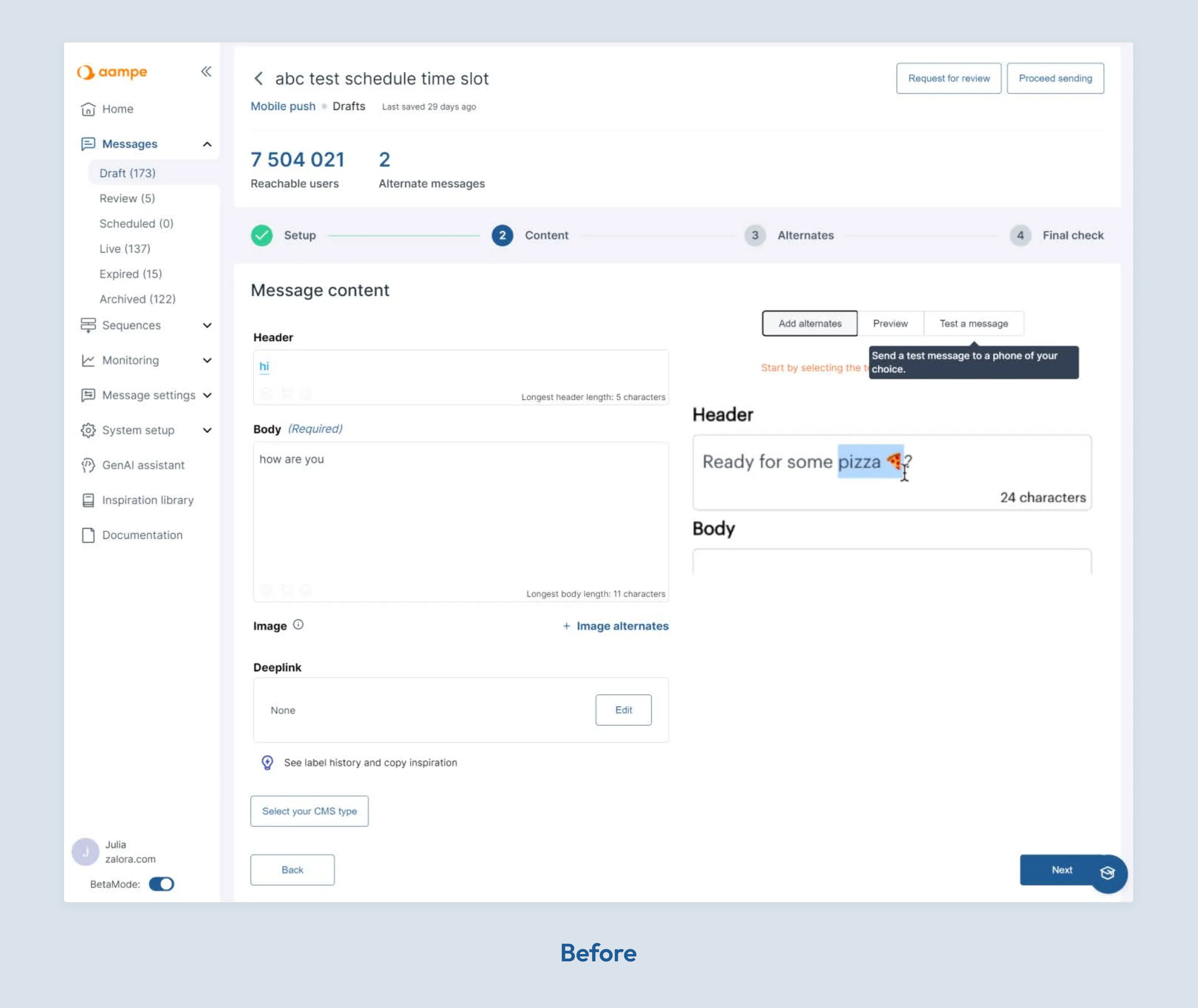
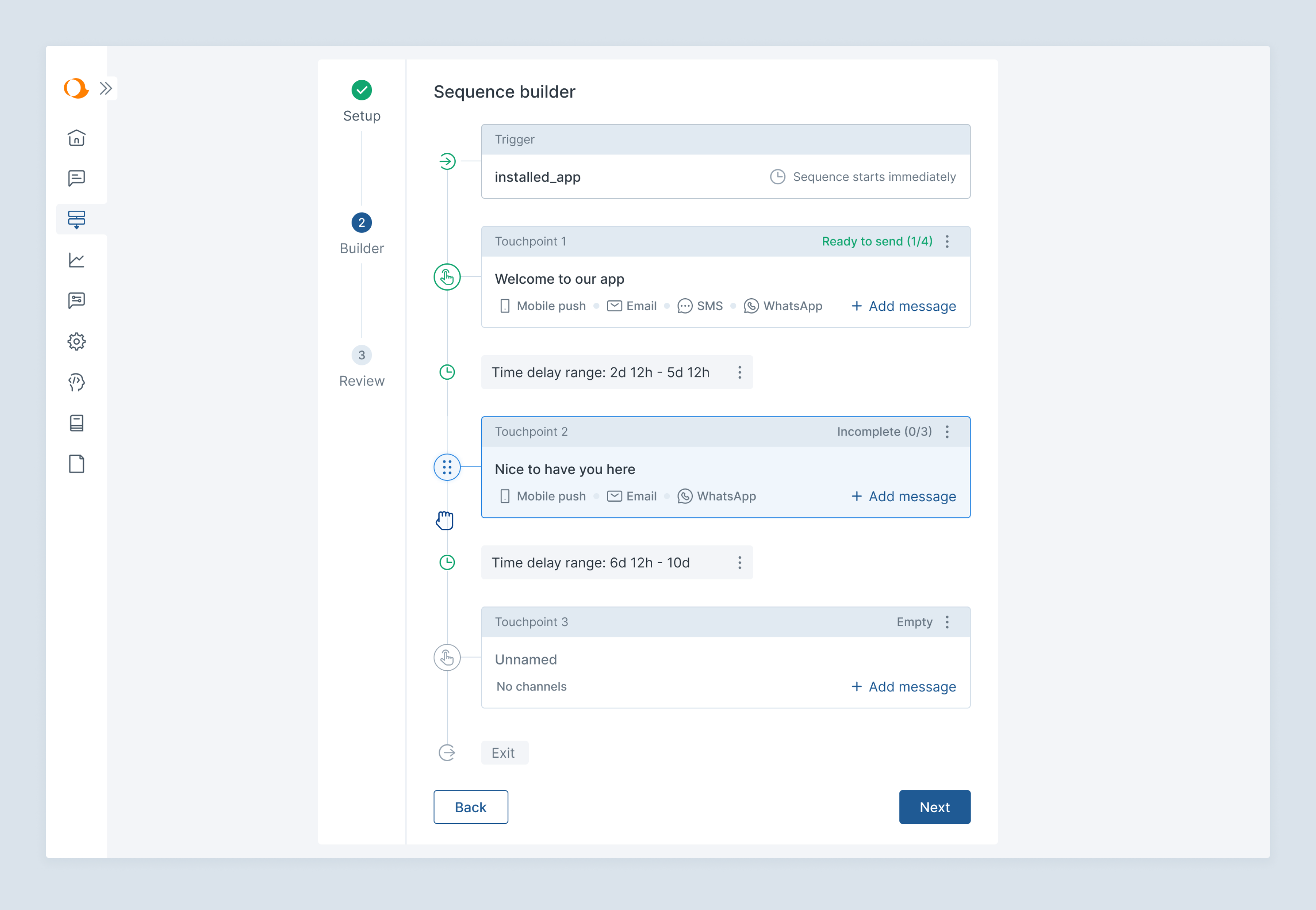
Streamlining Message Creation
Message creation is Aampe's core functionality, but the interface had grown crowded as features were added. Rather than a disruptive redesign, I applied the principle of "recognition over recall" by introducing a consolidated tool panel that grouped related actions logically.
This solution was particularly effective given Aampe's unique context—creating hundreds of message variations requires an interface that reduces cognitive load while maintaining access to powerful tooling.
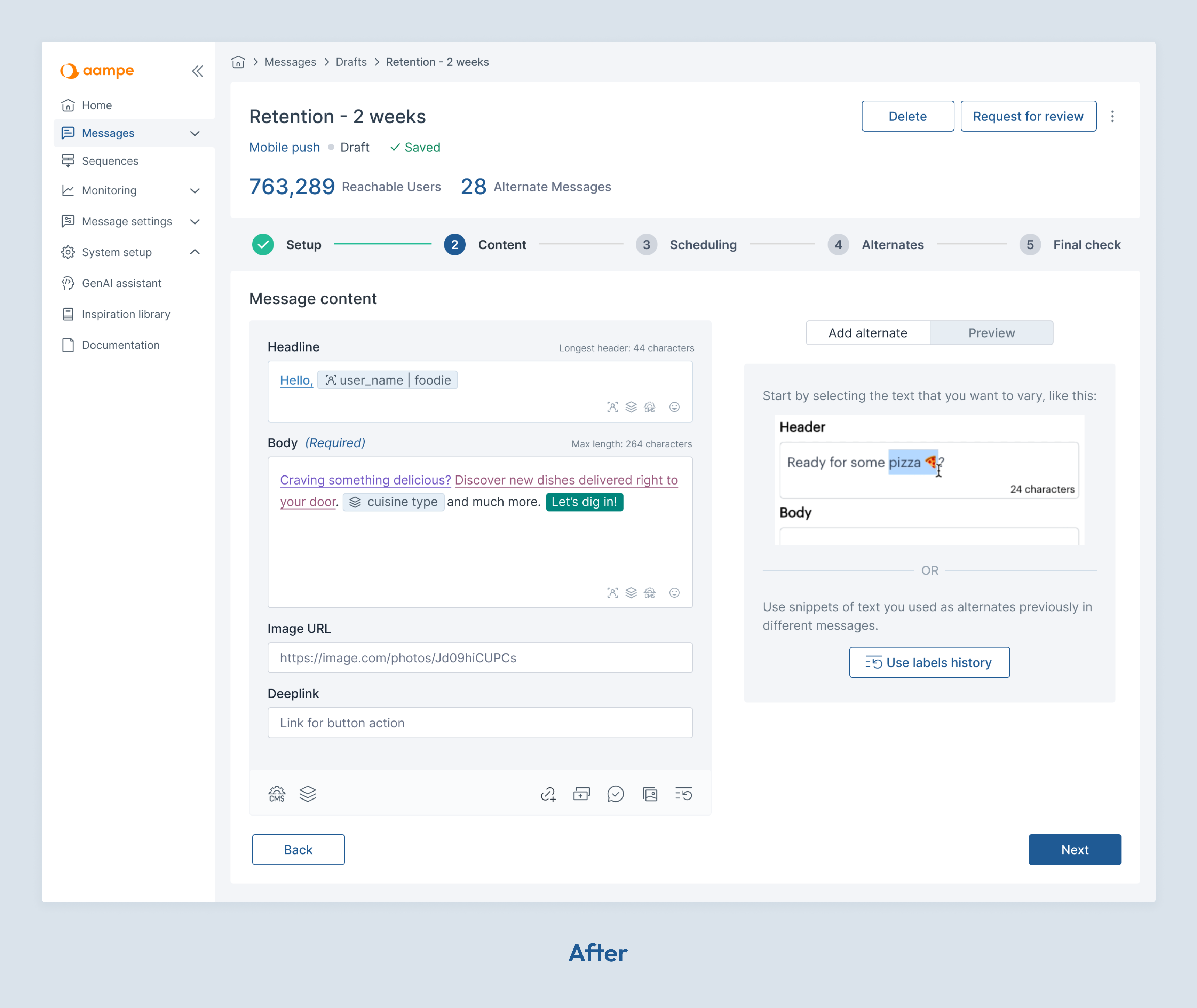
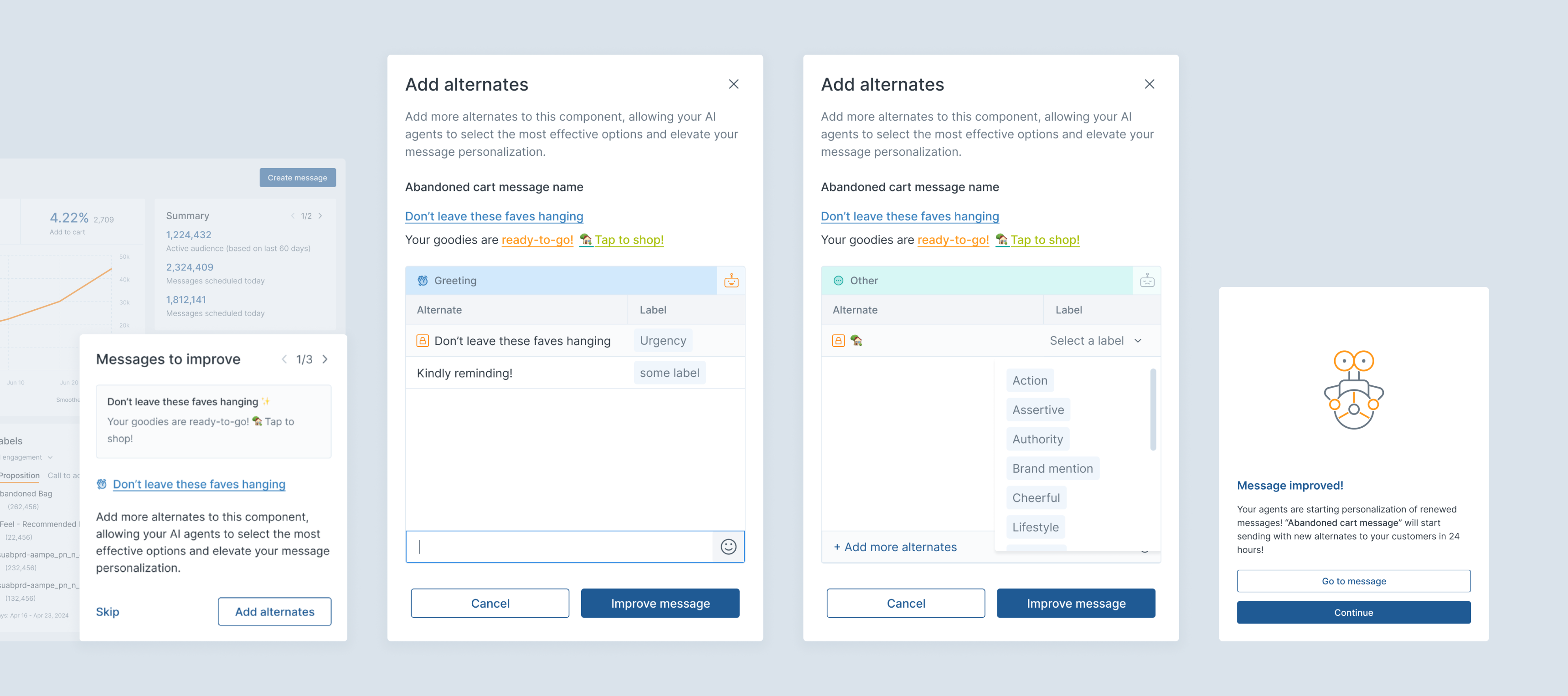
Streamlining Message Improvement
To address the challenge of maintaining message freshness without overwhelming users, I applied two key principles from behavioral psychology:
- Hick's Law: Decision time increases with each additional choice
- Goal-Gradient Effect: People are more motivated when they can see clear progress
I created a focused improvement flow on the homepage that suggests specific messages needing freshness improvement, removing decision paralysis and creating a clear starting point. I also enhanced the labels' history feature, providing quick access to previously used text snippets organized by component types and labels, with multi-select functionality for efficient message creation.
Balancing Common Patterns with Unique Functionality
Message creation is Aampe's core functionality, but the interface had grown crowded as features were added. Rather than a disruptive redesign, I applied the principle of "recognition over recall" by introducing a consolidated tool panel that grouped related actions logically.
This solution was particularly effective given Aampe's unique context—creating hundreds of message variations requires an interface that reduces cognitive load while maintaining access to powerful tooling.
Collaboration Approach
My success at Aampe relied on close collaboration with diverse team members:
- Data Scientists: I translated complex algorithms into coherent visualizations that made AI decisions understandable
- Developers: Working one sprint ahead of development, I provided designs that balanced ambition with technical feasibility
- Customer Success: Through active feedback loops, I identified emerging user needs and validated solutions
- Product Management: I co-created specifications that aligned business goals with user experience
Impact and Results
My design work at Aampe yielded significant results:
- Helped the company secure $18 million in Series A funding
- Expanded the product's feature set by approximately 40%
- Transformed data visualization to provide clear insights at a glance
- Created scalable design patterns that supported rapid growth
Reflection
Working as Aampe's designer taught me to balance competing priorities:
- Maintaining familiar patterns while supporting innovative functionality
- Making complex data accessible without oversimplification
- Delivering immediate improvements while building for the future
My approach centered on understanding the unique context of Aampe's product—where every message has hundreds of variations and proprietary AI technology plays a central role in delivery. By designing through this lens, I created interfaces that not only looked better but fundamentally improved how users interacted with the platform, ultimately contributing to the company's significant growth and funding success.